Getting started with QML and QtQuick
What is QML and QtQuick?
QML, or Qt Markup Language, is a declarative language used to simplify the development with its neatly organized grammatical structure. QML is used to build QtQuick, to assist in building complex user interfaces. It's an easy to learn Javascript-based declarative markup and allows the quick creation and deployment of GUIs.
Getting Started with Qt/QML
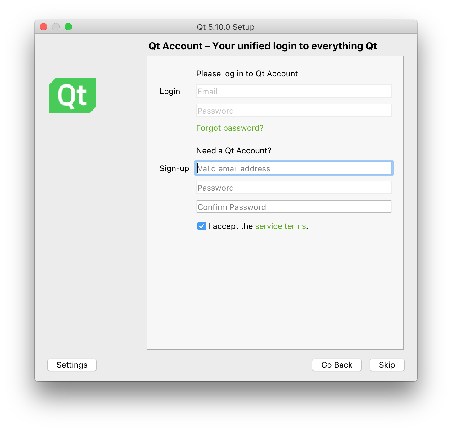
Download the Qt online installer for the best installation and setup. This installer will also assist you in installing mobile versions for iOS and Android; including any dependencies that are needed.
Preferred installation method: Qt Installer
Offline and online installers are available here.
A qt.io account is needed to install.- Edit: As reader @Larpon reports, it is possible to skip the login step in the installer.
- Build Kits are setup properly in QtCreator.
Alternate installation method
You may use repository installation. Do note that these installs may require additional setup. You will also need to download the QtCreator IDE separately.
- A qt.io account is not needed when using this method.
- Build Kits require additional setup in QtCreator.
# On macOS with homebrew:
brew install qt5

# On Ubuntu with apt:
sudo apt-get install qt5
QtCreator
QtCreator is the preferred IDE for Qt-based projects.
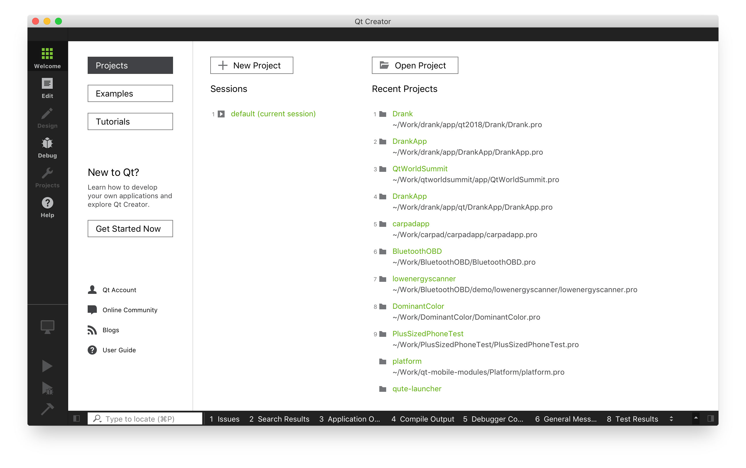
Start by downloading and installing the Qt SDK which includes the Qt libraries and the Qt Creator IDE.
Once you've installed the Qt SDK, go ahead and launch QtCreator, the well-built IDE for anything Qt. Create a new project. Choose a new Qt Quick Application which will allow maximum flexibility in creating C++/QML hybrid applications.
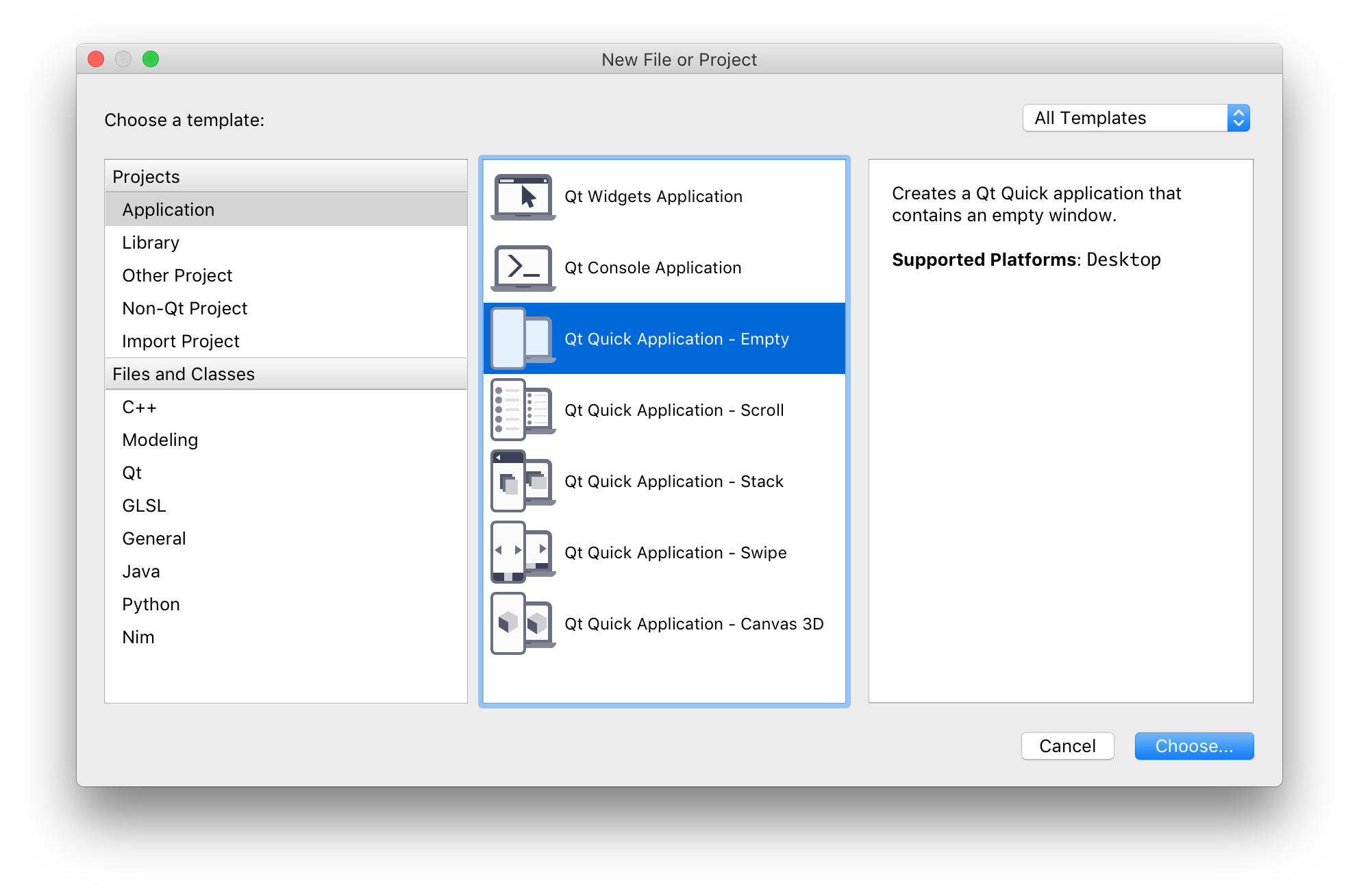
Choose a name for your project. The name you place in here can be changed later by simply renaming the *.pro file that is created.
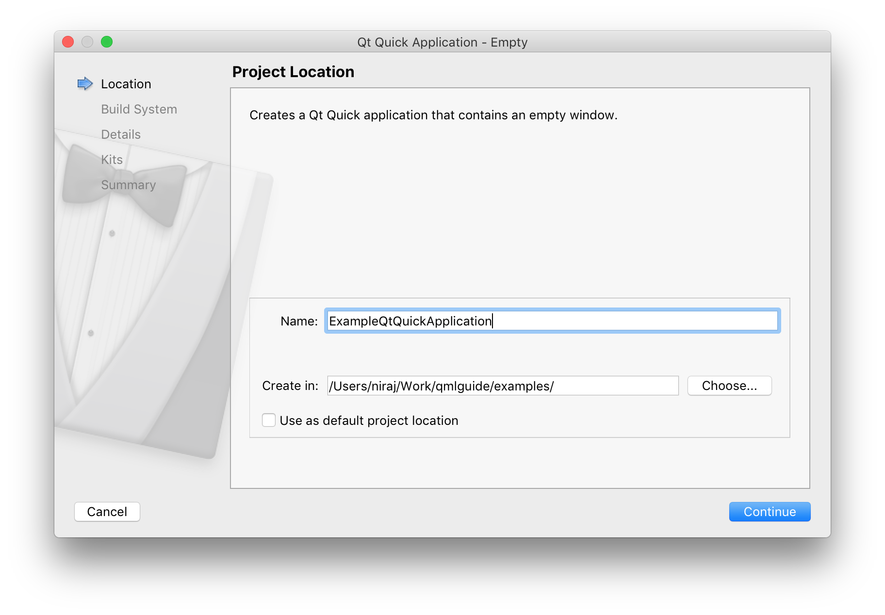
In this example, QtCreator will automatically create two folders:
$ ls /Users/niraj/Work/qmlguide/examples/
- ExampleQtQuickApplication/
- build-ExampleQtQuickApplication-Qt510-Debug/
Build Systems
A variety of build systems are supported by QtCreator.
qmake
qmake is Qt's original build system. It uses an esoteric language to generate Makefiles which are then used by the make tool to build code into binaries.
qmake is the preferred build system when building Qt code for multiple supported platforms, i.e. iOS and Android.
I have found it difficult to integrate other open source projects with qmake-based projects cleanly. This can always be supported by wrapping qmake in bash-based build scripts.
The qmake tool helps simplify the build process for development projects across different platforms. It automates the generation of Makefiles so that only a few lines of information are needed to create each Makefile. You can use qmake for any software project, whether it is written with Qt or not.
CMake
CMake is an open source build tool used for many C/C++ projects.
CMake is preferred if the platform is not iOS / Android. I have found CMake the better option as it can be easily integrated with many open source applications / projects. It is also really well documented.
CMake is an open-source, cross-platform family of tools designed to build, test and package software. CMake is used to control the software compilation process using simple platform and compiler independent configuration files, and generate native makefiles and workspaces that can be used in the compiler environment of your choice.
QBS
This is a relatively new build system, maintained by Qt, based on the QML language.
More information can be found here.
Qbs is a tool that helps simplify the build process for developing projects across multiple platforms. Qbs can be used for any software project, regardless of programming language, toolkit, or libraries used.
Building and Running
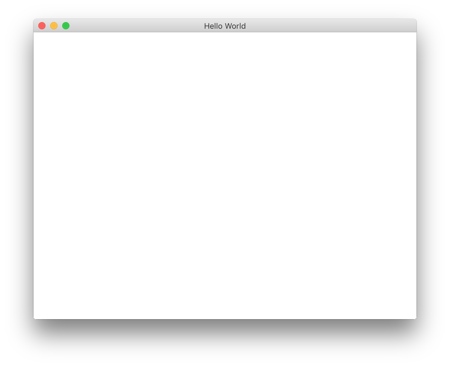
Hit the green play button and your project will build and run!
You will now see a blank window similar to this:
QtQuick - Basic Elements
QML is a language, QtQuick is a UI framework built on top of Qt in the QML language.
Item - This element is the absolute basic element. It is a pure QQuickItem with no visible or drawn pixels. Every QML element extends the Item element. I generally use this element as a wrapper element for pages, screens, dialogs, etc. It's generally preferred for structures over the Rectangle element due to it's undrawn and invisible nature.
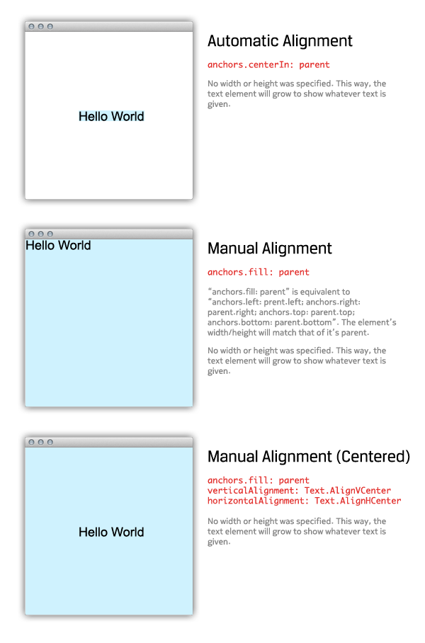
anchors is a object property of Item that allows you to position any Item-derived element relative to any other Item-derived element. This is one of the greatest features of QML when designing GUIs for multiple resolution.
Rectangle - This element is basically an Item element with a colored fill. It is possible to have an uncolored Rectangle by using color: "transparent" as a property. Again, Item is usually preferred to a Rectangle due to this colored fill. It is more efficient to use an Item as a wrapper as it reduces the number of pixels required to be drawn; especially on GL graphics views where the entire screen is repainted when one pixel is changed.
Another advantage of the Rectangle element over the Item element is that it contains a border property. This can prove useful when one requires other items, such as Images, to be surrounded by a colored border of variable width. See more properties of Rectangle in the Qt Documentation.
Image - This element is used to load an image, from a local file or from a URL. It is important to understand the asynchronous property of the Image element. By default, if your source is a local file, asynchronous: false is default. If your source is a network file (indicated by the http search path), asynchronous: true would be the default.
This is an important consideration when building GUIs with image-based structures, or GUIs that rely on the width/height of the image that's expected to be loaded. We'll go over more of this later on in this guide. View the Qt documentation for more helpful properties of the Image element.
BorderImage - This element is great for using one graphic at multiple width/height scenarios. This is very similar to Android's 9-patch image drawing mechanism – with the main difference being the BorderImage only allows for one stretchable zone in the x or y direction. Android's 9-patch allows for multiple stretch zones.
A Qt port is available in QtQuick Controls in the Android style here.
This element is very useful when building different sized buttons with the same graphic. View the Qt documentation for several visual examples.
Gradient - This element draws a color-blend (gradient). It can be assigned to the gradient property of Rectangle.
Text - This element is the preferred choice when displaying text on a GUI. This element accepts HTML as an input to the text property. This will prove useful when you need to bold or italicize only parts of text; for example, text: "<b>Name:</b>John Doe". You will need to consider alignment whenever using the Text element. Lucky for us, the guys at Qt developed a very intuitive method of aligning any piece of text.
Here're a couple examples you can refer to when dealing with text:
When dealing with paragraphs of text, maximumLineCount, wrapMode, and elide will prove immensely useful.
Combining a Text element with a Flickable element can give you a neat panning effect for scrollable Text views. Just set the Flickable's contentWidth and contentHeight to the Text element's paintedWidth and paintedHeight respectively.
TextEdit - This element can be used to provide keyboard input into your GUI. I prefer using a heavily modified Text element to achieve this task when using a touchscreen device as this element doesn't provide the flexibility in alignment and fill as the Text element. View more information about TextEdit in the Qt Documentation.
MouseArea - This element allows hitareas to be placed in your GUIs. This element (using anchors) can fill every Item-derived element with a hitarea. It is generally acceptable to subclass the basic MouseArea element with a MouseArea element that contains anchors.fill: parent as the MouseArea must know who to apply the hitarea to; in more cases than not, the MouseArea will fill it's parent.
The Qt MouseEvent system employs three crucial mouse events; including press, release, and click. A click is always built of one press and one release. Mouse events always follow this order: press, release, click. A click is only achieved if the press and release occur on the same MouseArea.
This is an important concept when building GUIs for touchscreen devices where a user may accidentally "press" a button, but "release" over another part of the GUI. This will have no effect on the GUI as the click event will not be created. This allows the user to change their mind while navigating a GUI.
Also, when building GUIs for touchscreens, one must take into consideration the touch resolution of the touchscreen. If a resistive touchscreen is used, accuracy can be within ~20%. By increasing the size of the mousearea relative to the button it is covering, can allow a more user-friendly experience. To do this, use anchors.centerIn: parent assuming the parent is the button. Then, set the width and height of the MouseArea to 1.5x the width and height of the intended button target.
The MouseArea element also contains several drag properties to allow dragging of any Item-derived element across a screen. This is particularly tricky as you would have to implement a position persisting mechanism to triumph the deletion of any QML components. Read more about the MouseArea in the Qt Documentation.
QtQuick View Elements
View elements in QtQuick strictly adhere to the model-view paradigm in that each View element we cover in this section has a model and a delegate property.
The model can be a ListModel, XmlListModel, QAbstractListModel, a QList of QObjects, a QStringList, and several other Javascript-based data structures. See here for more information about data models.
The delegate is generally a Component-based object that you would like to repeat. For a list view of text, this would be a rectangle with text in it. For a coverflow-esque carousel, this would be an image. Components are useful in low-resource environments as they're not instantiated until needed.
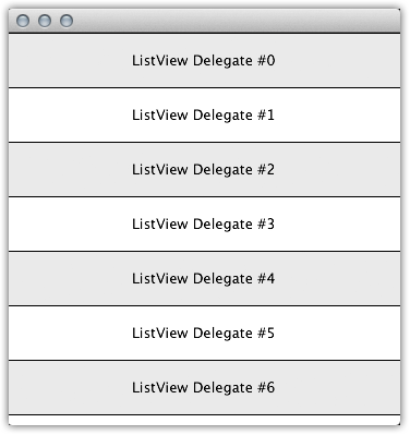
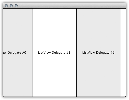
ListView - This element is useful in creating lists or carousels of objects. The ListView element does not allow a repeating or circular carousel. The ListView element can be positioned horizontally or vertically using the orientation property.
ListView inherits Flickable; allowing developers to modify the contentX and contentY of the element.
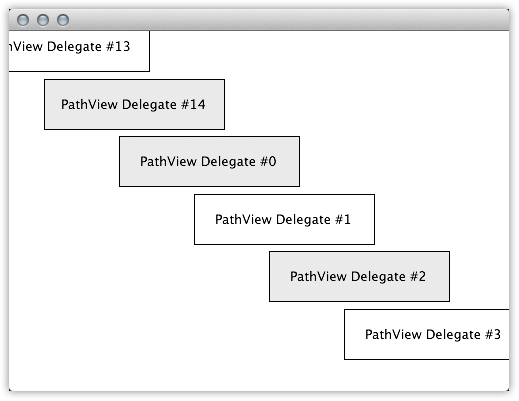
PathView - This element is useful in creating more customized carousels of objects. The PathView includes an additional path property and a pathItemCount property that allows you to set the track on which the objects move around the view. The PathView is always a repeating or circular view. The PathView element can be positioned horizontally, vertically, diagonally, along any axis using the path property with the Path element. The PathAttribute property helps add different attributes for objects on different parts of the path make the PathView one of the most flexible views available in QtQuick.
PathView does not inherit Flickable. If you're trying to modify the position of an item along a PathView, consider the highlightRangeMode by modifying the preferredHighlightBegin and the preferredHighlightEnd of your PathView.
The choice between a ListView element and a PathView element for your next carousel or list relies on one simple fact: Does your view need to repeat? If so, you need a PathView. Does your view require non-straight paths? If so, you need a PathView.
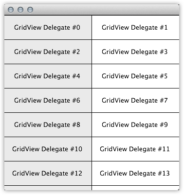
GridView - This element is useful in creating grids of objects. GridView relies on two important properties, cellWidth and cellHeight to properly calculate the size of each object's wrapper. The component delegate would be placed within this cell.
GridView also inherits Flickable; allowing developers to modify the contentX and contentY of the element.
Subscribe to QML Guide
Get the latest posts delivered right to your inbox
